
CMF Application - Reverse Engineering
Year
2026
Skills
3D Modeling
CMF Trend Research
Color Trend Spotting
This project takes a closer look at a best selling Black + Decker Juicer, to understand its form, function, and engineering down to the finest detail. Understanding the mechanics of the product is paired with in depth CMF research.
New found color, material, and finish trends and applications are applied to the product to maximize industry and trend presence in a new set of stunning colorways.


The product.
The Black + Decker 32oz Electric Juicer was purchased to be deconstructed, analyzed, and reverse engineered in SolidWorks for CMF applications and engineering understanding.
The product.
The Black + Decker 32oz Electric Juicer was purchased to be deconstructed, analyzed, and reverse engineered in SolidWorks for CMF applications and engineering understanding.
The mission.
Each component of the juicer was dismantled, with special focus being placed on the functional and emotional impacts of their colors, materials, and finishes.
The mission.
Each component of the juicer was dismantled, with special focus being placed on the functional and emotional impacts of their colors, materials, and finishes.

Color trends to note.
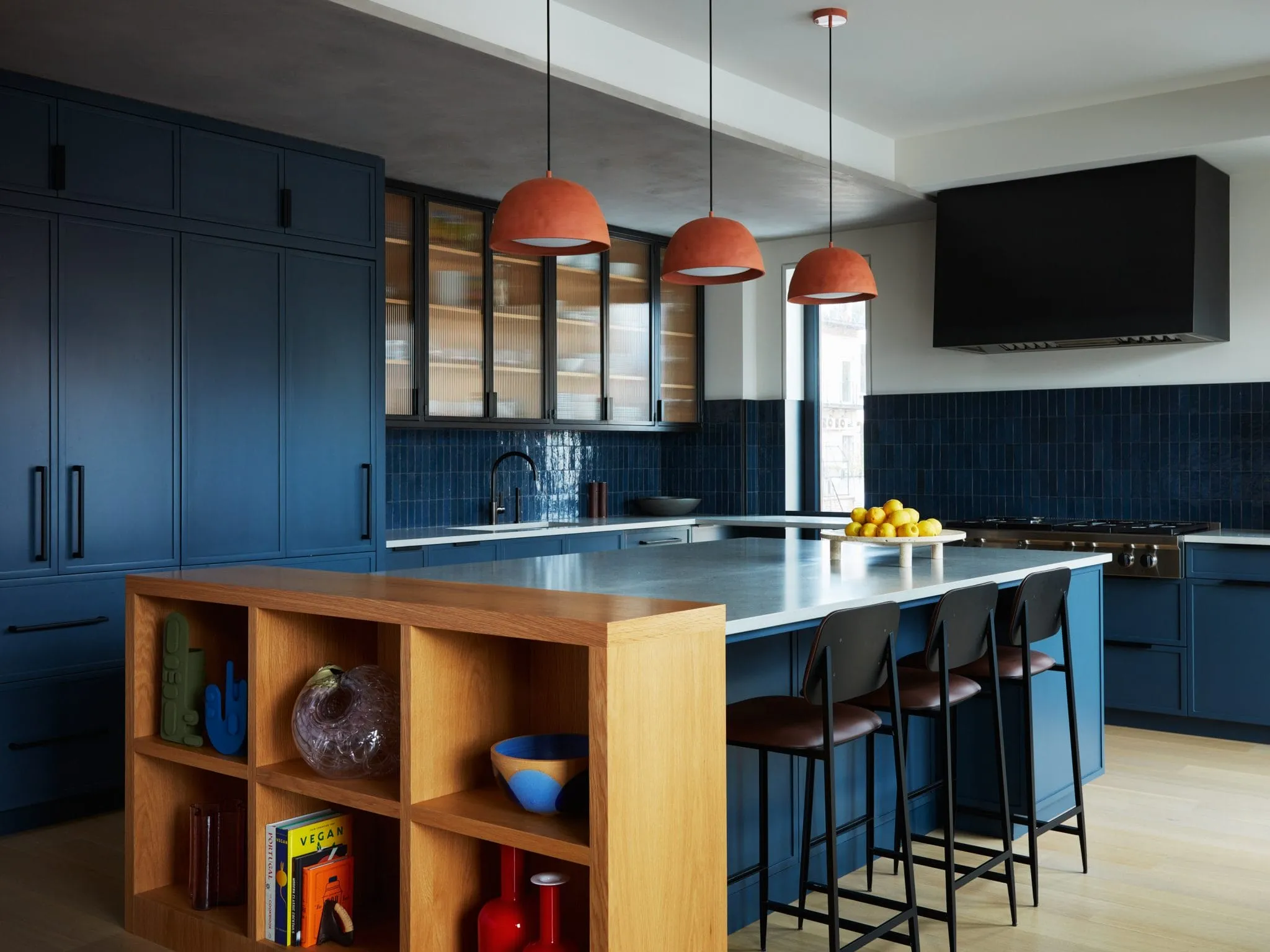
Bold Color Blocking
Playful, vivid, single color territories to break up monochromatic palettes and products.
Decorilla 2025

Mismatched Pastels
Soft saturation and muted pastels, grounded in playful, yet 'grown-up' contrasts between the colors.
Yonoh: Milan Design Week 2025

Warm Terracotta
A distinct warmth added by muted terracottas, creating a sense of organic, welcoming Americana.
Capdell 2025

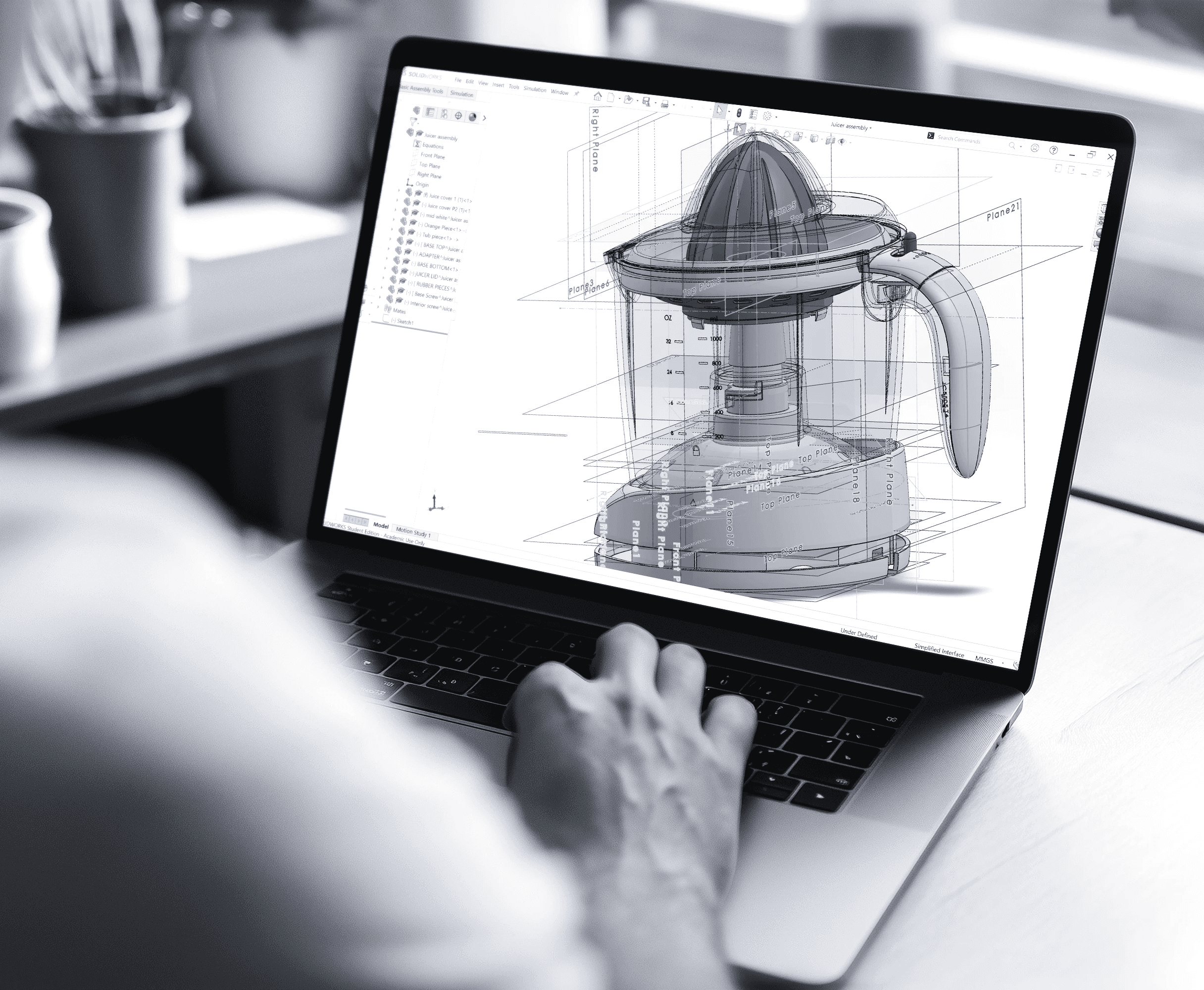


Reverse engineered model.
Each component of the juicer was individually modeled, and assembled together in SolidWorks 3D.
Reverse engineered model.
Each component of the juicer was individually modeled, and assembled together in SolidWorks 3D.


Attention to detail.
Special attention was placed on the fitment and tolerances between each part, as well as mechanical properties.
Attention to detail.
Special attention was placed on the fitment and tolerances between each part, as well as mechanical properties.
Attention to detail.
Special attention was placed on the fitment and tolerances between each part, as well as mechanical properties.

Color trends to note.
Bold Color Blocking
Playful, vivid, single color territories to break up monochromatic palettes and products.
Decorilla 2025
Mismatched Pastels
Soft saturation and muted pastels, grounded in playful, yet 'grown-up' contrasts between the colors.
Yonoh: Milan Design Week 2025
Warm Terracotta
A distinct warmth added by muted terracottas, creating a sense of organic, welcoming Americana.
Capdell 2025
Color methodology.
Choosing colors to selectively compliment the color of the juice that will be inside creates a playful color experience for the user.
Taking inspiration from the colors of the juices and fruits commonly associated with commercial juicers will guide the mission.
Color methodology.
Choosing colors to selectively compliment the color of the juice that will be inside creates a playful color experience for the user.
Taking inspiration from the colors of the juices and fruits commonly associated with commercial juicers will guide the mission.

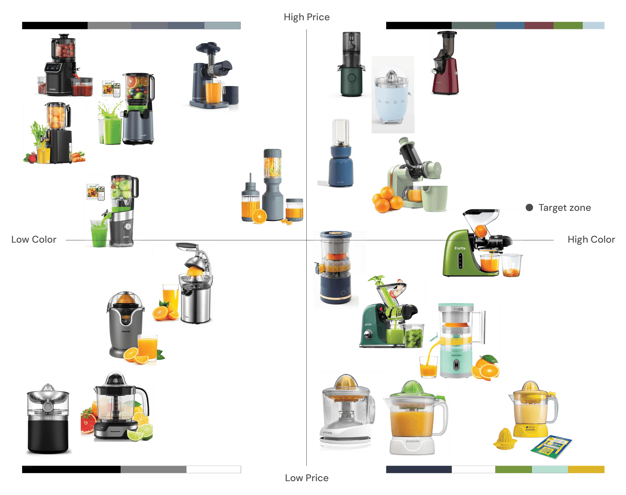
Market analysis.
Comparing price and color saturation across the current juicer market to derive palette relationships, and inspire color trends for this product line.
Market analysis.
Comparing price and color saturation across the current juicer market to derive palette relationships, and inspire color trends for this product line.
What's inside?
What colors do the juices add to the product holding it?
How can these colors create potential palettes?
What's inside?
What colors do the juices add to the product holding it?
How can these colors create potential palettes?

What's Missing?
What's Missing?

What can be added?
What colors are missing from the palette provided by the juice in the product?
These colors represent color opportunities that can be added to a product line to compliment the juices.
What can be added?
What colors are missing from the palette provided by the juice in the product?
These colors represent color opportunities that can be added to a product line to compliment the juices.
Synthesizing color.
Comparing key colors from the juice inspiration, opportunity colors, and colors from the current juicer market lead to key insights in potential color and palette harmonies.
Synthesizing color.
Comparing key colors from the juice inspiration, opportunity colors, and colors from the current juicer market lead to key insights in potential color and palette harmonies.


The final products.
The colors of the three products all tie nicely together, measuring the same relationship between primary, secondary, and tertiary appearances.
Some Pantones are seen across multiple products to create a "product family" relationship.
The final products.
The colors of the three products all tie nicely together, measuring the same relationship between primary, secondary, and tertiary appearances.
Some Pantones are seen across multiple products to create a "product family" relationship.

Brightness & hue.
The primary and tertiary colors in the palette feature a brightening relationship. The juice cap represents a lighter color in the relationship, indicating a point of user contact.
The brighter color in the relationship creates an intuitive user experience, and a welcoming emotion.
Brightness & hue.
The primary and tertiary colors in the palette feature a brightening relationship. The juice cap represents a lighter color in the relationship, indicating a point of user contact.
The brighter color in the relationship creates an intuitive user experience, and a welcoming emotion.

Previous Project
Halo
Protective Eyewear - Human Centered Design
Next Project
